Aesthetic Showcase [Version 2]
Quote from portal2tenacious on January 14, 2013, 11:24 pmCaden wrote:I'm pretty sure everyone here also thinks that I'm less than dirt. That hurts.People are just inserting their opinions. You've stated that you're somewhat of a beginner, so their trying to give simple, to the point feedback.
Search "Piston" in ttghe models menu. Its the same model used for PeTI lifts.
The shadows are done with an env_projected_texture. It is used in the PeTI default observation window and can be very impressive if used correctly.
People are just inserting their opinions. You've stated that you're somewhat of a beginner, so their trying to give simple, to the point feedback.
Search "Piston" in ttghe models menu. Its the same model used for PeTI lifts.
The shadows are done with an env_projected_texture. It is used in the PeTI default observation window and can be very impressive if used correctly.
Quote from Caden on January 14, 2013, 11:28 pmAlright, I guess that allows me to justify my apparent boring Hammer abilities.
At least a little!
Alright, I guess that allows me to justify my apparent boring Hammer abilities.
At least a little!
Quote from BenVlodgi on January 15, 2013, 1:54 amCaden wrote:Just to be clear this is just an initiative for me to get better at using Hammer, it's not like I think I'm some kind of "expert" at this stuff. I don't expect this mod to really be that big of a deal.well in the OP, you sound like you are recreating the original (made by expert level designers) better than how they did it. While also ramping up the aesthetic quality.... Both are tall orders, and you are no expert in hammer, so you're going to have to do a lot of learning to just get on par with the original.....
Caden wrote:Recently, as some people remember, I have been working on a mod, or "Map-Pack", that recreates all of the levels from Portal: The Flash Version. This mod is supposed to both fix any problems that the original mod demonstrated, as well as act as a High-Definition remix (similar to rHetorical's Alive & Kicking).I would love to replay PTFV in Portal 2, so I'll look forward to the final release, which I dont expect to be for a few years, because these things take time
well in the OP, you sound like you are recreating the original (made by expert level designers) better than how they did it. While also ramping up the aesthetic quality.... Both are tall orders, and you are no expert in hammer, so you're going to have to do a lot of learning to just get on par with the original.....
I would love to replay PTFV in Portal 2, so I'll look forward to the final release, which I dont expect to be for a few years, because these things take time ![]()
Quote from FelixGriffin on January 15, 2013, 8:34 amAlso, those are some of the glass lights I was talking about.
Also, those are some of the glass lights I was talking about. ![]()
Quote from josepezdj on January 15, 2013, 12:00 pmBenVlodgi wrote:^^^ Listen to this guy, he makes the prettiest maps ever, look at his signature... check out those maps, learn from the beautyWow Ben, thank you so much for such those nice words to me, man
I really appreciate that comment coming from an experienced and awesome mapper like you, dude!
 BenVlodgi wrote:well in the OP, you sound like you are recreating the original (made by expert level designers) better than how they did it. While also ramping up the aesthetic quality.... Both are tall orders, and you are no expert in hammer, so you're going to have to do a lot of learning to just get on par with the original..
This
@Caden: from the orignal post (I mean that other thread, not this one) I was under the impression you were an experienced mapper and I sincerely thought the idea of recreating the PTFM was awesome. But I think you rushed too much with pointing out the failures that mappack had (and I'm guessing you meant the mappack for Portal) and with saying you'll improve it. Don't take me wrong, I still cheer you up to do so, but, with the due respect, the first thing you should improve, and I'm saying this after reading your impressions and opinions about the previous mappack and about your own pictures, is your critical eye and your humility. Meaning that the most important thing is to have the ability to know what could be missing in a scene or what doesn't fit to the environment you're staring at... it takes quite some time to develop a good attention to detail and to polish your tastes.
Even though aesthetics is something highly dependant on personal tastes, there is a certain (implicit) consensus about what looks amazing and what does not, right?
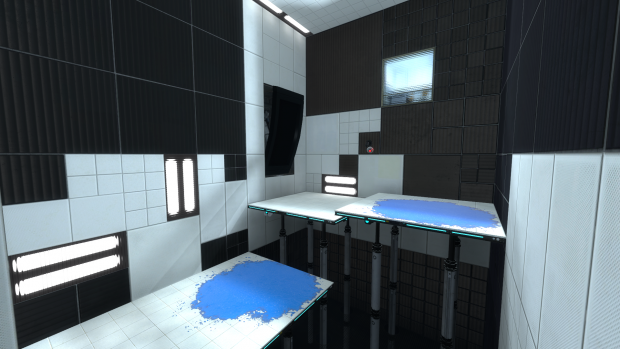
I'm suggesting you to practice this, to check and identify the differences between a well detailed chamber and another one; and try to compare a lot of them... as much as you can... and remember to extract what exactly is what is making you think a scene or environment is awesome. Many meters of white tiles is not attractive at all... you should know that and try to break the monotony by adding some light sources (props), observation rooms, or/and by clipping the brushes and introducing more than just 1 texture along your walls...
THIS IMAGE is a perfect example!
Can you see the differences I'm talking about when comparing that with your pictures?
As portal2tenacious mentioned, let's try to actually help out:
1. Those light panels are called light_covers. Introduce them in your level via a prop_static. Find them using the model browser. You have 3 skins for them: cool / warm / neutral. Use whatever of those, and add a light entity for example (this is the easiest/quicker way) in front of them trying to fit the props' mood/skin. Also, you have some instances into your folder sdk_content/instances/light.
2. Use the clipping tool more often and break your walls. try to avoid large rows of the same tile type; I've seen some of your screenshots make use of this... but most of them don't.
3. You can try to avoid simple square shaped chambers or corridors, introduce some corners too, or make some brushes to stand out from the rest to add diversity and cool shadows.
4. Signage is a key element (I personally think). I literally LOVE signage. I use to make a new support for them into each map and to tweak each symbol somehow to make it fit to the rest ot the theme... Also signage is a very distinctive feature in Portal (at least to me
).
5. Use more dynamic stuff. Portal2 allows you to use a wide range of moving panels, stairs or lifters. As mentioned above check out for the word 'piston' into the model browser and use them to make elevated floors, instead of making it out of brushes. Add some goo pits too... and if you don't mean to use it as a hazard elemnt, just cover it with a grate, but add some light panels below so the water is noticeable.... and ofc add frames to that grate...
Dunno.... there are many things that could be done... always try to be creative and avoid simple things and laziness
Wow Ben, thank you so much for such those nice words to me, man ![]() I really appreciate that comment coming from an experienced and awesome mapper like you, dude!
I really appreciate that comment coming from an experienced and awesome mapper like you, dude!
This
@Caden: from the orignal post (I mean that other thread, not this one) I was under the impression you were an experienced mapper and I sincerely thought the idea of recreating the PTFM was awesome. But I think you rushed too much with pointing out the failures that mappack had (and I'm guessing you meant the mappack for Portal) and with saying you'll improve it. Don't take me wrong, I still cheer you up to do so, but, with the due respect, the first thing you should improve, and I'm saying this after reading your impressions and opinions about the previous mappack and about your own pictures, is your critical eye and your humility. Meaning that the most important thing is to have the ability to know what could be missing in a scene or what doesn't fit to the environment you're staring at... it takes quite some time to develop a good attention to detail and to polish your tastes.
Even though aesthetics is something highly dependant on personal tastes, there is a certain (implicit) consensus about what looks amazing and what does not, right?
I'm suggesting you to practice this, to check and identify the differences between a well detailed chamber and another one; and try to compare a lot of them... as much as you can... and remember to extract what exactly is what is making you think a scene or environment is awesome. Many meters of white tiles is not attractive at all... you should know that and try to break the monotony by adding some light sources (props), observation rooms, or/and by clipping the brushes and introducing more than just 1 texture along your walls...
THIS IMAGE is a perfect example! ![]()
Can you see the differences I'm talking about when comparing that with your pictures?
As portal2tenacious mentioned, let's try to actually help out:
1. Those light panels are called light_covers. Introduce them in your level via a prop_static. Find them using the model browser. You have 3 skins for them: cool / warm / neutral. Use whatever of those, and add a light entity for example (this is the easiest/quicker way) in front of them trying to fit the props' mood/skin. Also, you have some instances into your folder sdk_content/instances/light.
2. Use the clipping tool more often and break your walls. try to avoid large rows of the same tile type; I've seen some of your screenshots make use of this... but most of them don't.
3. You can try to avoid simple square shaped chambers or corridors, introduce some corners too, or make some brushes to stand out from the rest to add diversity and cool shadows.
4. Signage is a key element (I personally think). I literally LOVE signage. I use to make a new support for them into each map and to tweak each symbol somehow to make it fit to the rest ot the theme... Also signage is a very distinctive feature in Portal (at least to me ![]() ).
).
5. Use more dynamic stuff. Portal2 allows you to use a wide range of moving panels, stairs or lifters. As mentioned above check out for the word 'piston' into the model browser and use them to make elevated floors, instead of making it out of brushes. Add some goo pits too... and if you don't mean to use it as a hazard elemnt, just cover it with a grate, but add some light panels below so the water is noticeable.... and ofc add frames to that grate... ![]()
Dunno.... there are many things that could be done... always try to be creative and avoid simple things and laziness 


 useful tools and stuff here on TWP
[spoiler]


 [/spoiler]
Quote from Caden on January 15, 2013, 5:58 pmjosepezdj wrote:BenVlodgi wrote:^^^ Listen to this guy, he makes the prettiest maps ever, look at his signature... check out those maps, learn from the beautyWow Ben, thank you so much for such those nice words to me, man 😀 I really appreciate that comment coming from an experienced and awesome mapper like you, dude! :notworthy:
BenVlodgi wrote:well in the OP, you sound like you are recreating the original (made by expert level designers) better than how they did it. While also ramping up the aesthetic quality.... Both are tall orders, and you are no expert in hammer, so you're going to have to do a lot of learning to just get on par with the original..This
@Caden: from the orignal post (I mean that other thread, not this one) I was under the impression you were an experienced mapper and I sincerely thought the idea of recreating the PTFM was awesome. But I think you rushed too much with pointing out the failures that mappack had (and I'm guessing you meant the mappack for Portal) and with saying you'll improve it. Don't take me wrong, I still cheer you up to do so, but, with the due respect, the first thing you should improve, and I'm saying this after reading your impressions and opinions about the previous mappack and about your own pictures, is your critical eye and your humility. Meaning that the most important thing is to have the ability to know what could be missing in a scene or what doesn't fit to the environment you're staring at... it takes quite some time to develop a good attention to detail and to polish your tastes.
Even though aesthetics is something highly dependant on personal tastes, there is a certain (implicit) consensus about what looks amazing and what does not, right?
I'm suggesting you to practice this, to check and identify the differences between a well detailed chamber and another one; and try to compare a lot of them... as much as you can... and remember to extract what exactly is what is making you think a scene or environment is awesome. Many meters of white tiles is not attractive at all... you should know that and try to break the monotony by adding some light sources (props), observation rooms, or/and by clipping the brushes and introducing more than just 1 texture along your walls...
THIS IMAGE is a perfect example! 😉
Can you see the differences I'm talking about when comparing that with your pictures?
As portal2tenacious mentioned, let's try to actually help out:
1. Those light panels are called light_covers. Introduce them in your level via a prop_static. Find them using the model browser. You have 3 skins for them: cool / warm / neutral. Use whatever of those, and add a light entity for example (this is the easiest/quicker way) in front of them trying to fit the props' mood/skin. Also, you have some instances into your folder sdk_content/instances/light.
2. Use the clipping tool more often and break your walls. try to avoid large rows of the same tile type; I've seen some of your screenshots make use of this... but most of them don't.
3. You can try to avoid simple square shaped chambers or corridors, introduce some corners too, or make some brushes to stand out from the rest to add diversity and cool shadows.
4. Signage is a key element (I personally think). I literally LOVE signage. I use to make a new support for them into each map and to tweak each symbol somehow to make it fit to the rest ot the theme... Also signage is a very distinctive feature in Portal (at least to me :)).
5. Use more dynamic stuff. Portal2 allows you to use a wide range of moving panels, stairs or lifters. As mentioned above check out for the word 'piston' into the model browser and use them to make elevated floors, instead of making it out of brushes. Add some goo pits too... and if you don't mean to use it as a hazard elemnt, just cover it with a grate, but add some light panels below so the water is noticeable.... and ofc add frames to that grate... 😀
Dunno.... there are many things that could be done... always try to be creative and avoid simple things and laziness :thumbup:
I seriously need to find some good way to make a pit. That pit in the picture looks great- but how did he make it? With some sort of Block Light brush and then acid at the bottom? I don't even know a good acid texture...
Wow Ben, thank you so much for such those nice words to me, man 😀 I really appreciate that comment coming from an experienced and awesome mapper like you, dude! :notworthy:
This
@Caden: from the orignal post (I mean that other thread, not this one) I was under the impression you were an experienced mapper and I sincerely thought the idea of recreating the PTFM was awesome. But I think you rushed too much with pointing out the failures that mappack had (and I'm guessing you meant the mappack for Portal) and with saying you'll improve it. Don't take me wrong, I still cheer you up to do so, but, with the due respect, the first thing you should improve, and I'm saying this after reading your impressions and opinions about the previous mappack and about your own pictures, is your critical eye and your humility. Meaning that the most important thing is to have the ability to know what could be missing in a scene or what doesn't fit to the environment you're staring at... it takes quite some time to develop a good attention to detail and to polish your tastes.
Even though aesthetics is something highly dependant on personal tastes, there is a certain (implicit) consensus about what looks amazing and what does not, right?
I'm suggesting you to practice this, to check and identify the differences between a well detailed chamber and another one; and try to compare a lot of them... as much as you can... and remember to extract what exactly is what is making you think a scene or environment is awesome. Many meters of white tiles is not attractive at all... you should know that and try to break the monotony by adding some light sources (props), observation rooms, or/and by clipping the brushes and introducing more than just 1 texture along your walls...
THIS IMAGE is a perfect example! 😉
Can you see the differences I'm talking about when comparing that with your pictures?
As portal2tenacious mentioned, let's try to actually help out:
1. Those light panels are called light_covers. Introduce them in your level via a prop_static. Find them using the model browser. You have 3 skins for them: cool / warm / neutral. Use whatever of those, and add a light entity for example (this is the easiest/quicker way) in front of them trying to fit the props' mood/skin. Also, you have some instances into your folder sdk_content/instances/light.
2. Use the clipping tool more often and break your walls. try to avoid large rows of the same tile type; I've seen some of your screenshots make use of this... but most of them don't.
3. You can try to avoid simple square shaped chambers or corridors, introduce some corners too, or make some brushes to stand out from the rest to add diversity and cool shadows.
4. Signage is a key element (I personally think). I literally LOVE signage. I use to make a new support for them into each map and to tweak each symbol somehow to make it fit to the rest ot the theme... Also signage is a very distinctive feature in Portal (at least to me :)).
5. Use more dynamic stuff. Portal2 allows you to use a wide range of moving panels, stairs or lifters. As mentioned above check out for the word 'piston' into the model browser and use them to make elevated floors, instead of making it out of brushes. Add some goo pits too... and if you don't mean to use it as a hazard elemnt, just cover it with a grate, but add some light panels below so the water is noticeable.... and ofc add frames to that grate... 😀
Dunno.... there are many things that could be done... always try to be creative and avoid simple things and laziness :thumbup:
I seriously need to find some good way to make a pit. That pit in the picture looks great- but how did he make it? With some sort of Block Light brush and then acid at the bottom? I don't even know a good acid texture...
Quote from Caden on January 15, 2013, 6:15 pmportal2tenacious wrote:Caden wrote:I'm pretty sure everyone here also thinks that I'm less than dirt. That hurts.People are just inserting their opinions. You've stated that you're somewhat of a beginner, so their trying to give simple, to the point feedback.
Search "Piston" in ttghe models menu. Its the same model used for PeTI lifts.
The shadows are done with an env_projected_texture. It is used in the PeTI default observation window and can be very impressive if used correctly.
Argh! I still don't get it! None of them have an animation I can bind them to, which I figured is what the pistons are in the picture. But they won't work! What are some good mechanical dynamic pistons like the one that's in that picture?
People are just inserting their opinions. You've stated that you're somewhat of a beginner, so their trying to give simple, to the point feedback.
Search "Piston" in ttghe models menu. Its the same model used for PeTI lifts.
The shadows are done with an env_projected_texture. It is used in the PeTI default observation window and can be very impressive if used correctly.
Argh! I still don't get it! None of them have an animation I can bind them to, which I figured is what the pistons are in the picture. But they won't work! What are some good mechanical dynamic pistons like the one that's in that picture?
Quote from portal2tenacious on January 15, 2013, 7:37 pmThey don't have animations. You move them the old fashioned way. If you need help, I would love to give you some tips on steam. My name is tanger2b.
They don't have animations. You move them the old fashioned way. If you need help, I would love to give you some tips on steam. My name is tanger2b.
Quote from Caden on January 15, 2013, 7:47 pmOkay, I have experimented with this test for a while now, and I have gone through a few revisions.
I made the platform so it would be supported by platforms, unfortunately I still have no idea how to make a good pit effect, so I didn't really bother with what that; It's just some white tiles.
Then I started applying some H2F textures, to see how that would look
http://steamcommunity.com/sharedfiles/f ... =120662189
http://cloud.steampowered.com/ugc/59474 ... 79C2EF289/
Okay, I have experimented with this test for a while now, and I have gone through a few revisions.
I made the platform so it would be supported by platforms, unfortunately I still have no idea how to make a good pit effect, so I didn't really bother with what that; It's just some white tiles.
Then I started applying some H2F textures, to see how that would look
http://steamcommunity.com/sharedfiles/f ... =120662189
http://cloud.steampowered.com/ugc/59474 ... 79C2EF289/
Quote from CamBen on January 15, 2013, 10:21 pmNo offense, but that red clashes terribly with the rest of the textures. It also looks very flat in comparison to the other textures.
No offense, but that red clashes terribly with the rest of the textures. It also looks very flat in comparison to the other textures.
Aperture Science: We do our science asbestos we can!